deltaPhy

Software Systems
Integrated-system Design

Integrated-system Design

Features

Electrical Design Software Electrical Schematic Design Module
Component Symbol Design Software
Component Modelling Module
Electrical Layout Software
Electrical Layout Design Module
Component Footprint Design Software
Electrical Schematic Design Module

Guidance System

The Guidance System is available in the Schematic Editor and the Layout Editor.

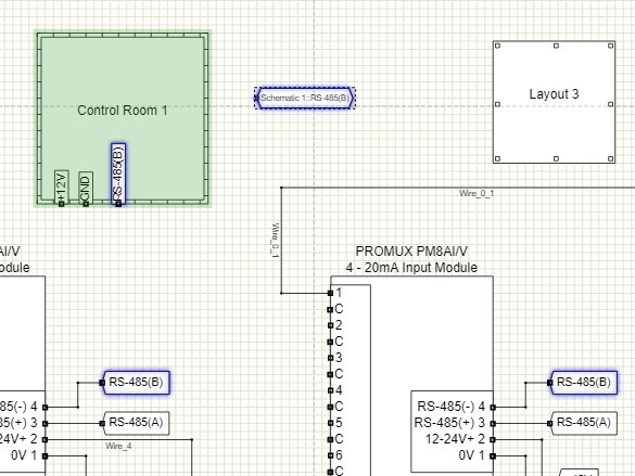
In the Schematic Editor, the Guidance System indicates which other electrical connections in the schematic, are compatible with the electrical connection the mouse is being hovered on.

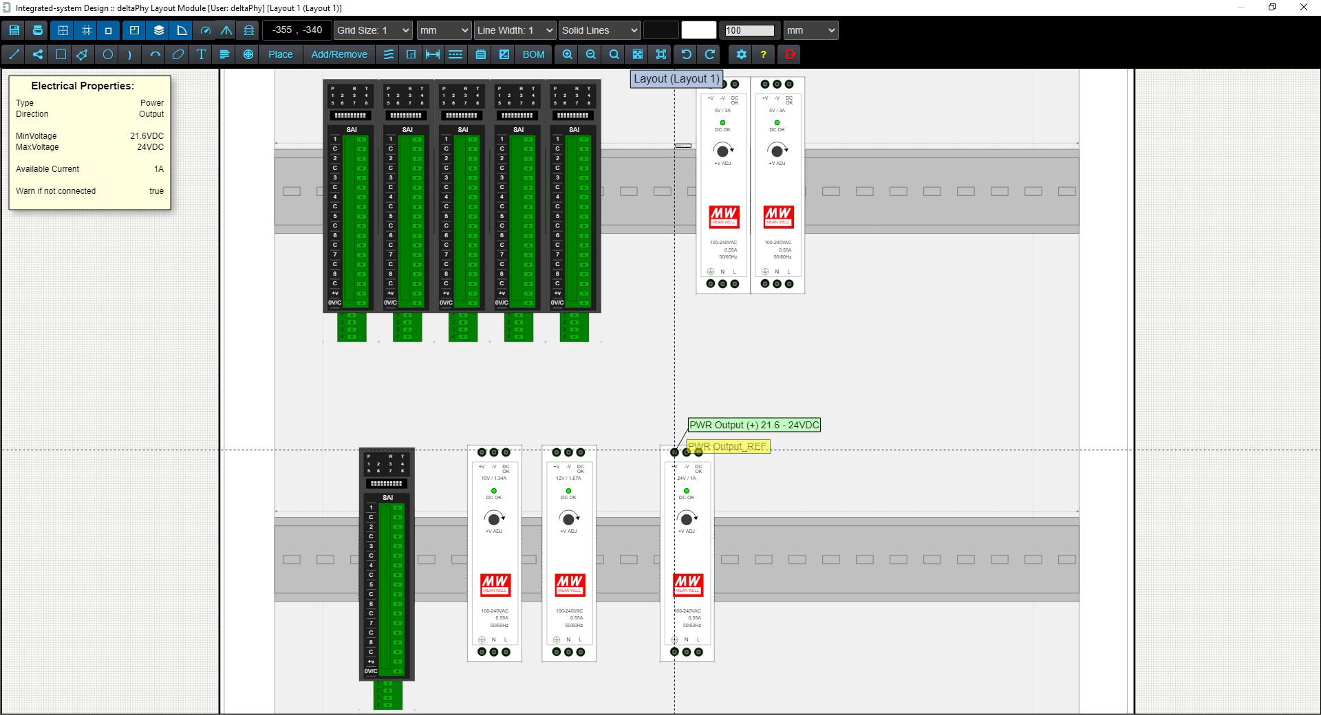
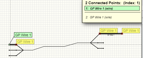
In the Layout Editor, the Guidance System indicates which connections are wired to other connections (according to the schematic), therefore indicating where to physically route the wires and cables.

There are 3 display modes for the Guidance System:

  1. guidance system button OFFNone
  2. guidance system button ON (lines)Lines
  3. guidance system button ON (hot-spots)Hot Spots

These display modes can be toggled through using the toolbar button to toggle guidance system toolbar button in the Schematic Editor and Layout Editor.

The display modes can be toggled through by pressing the C key in both the Schematic and Layout Editors.

The idea with the display mode is to select which mode suits better at the time. Sometimes lines are better when drawing out a wire. Other times, hot-spots may be more suitable.


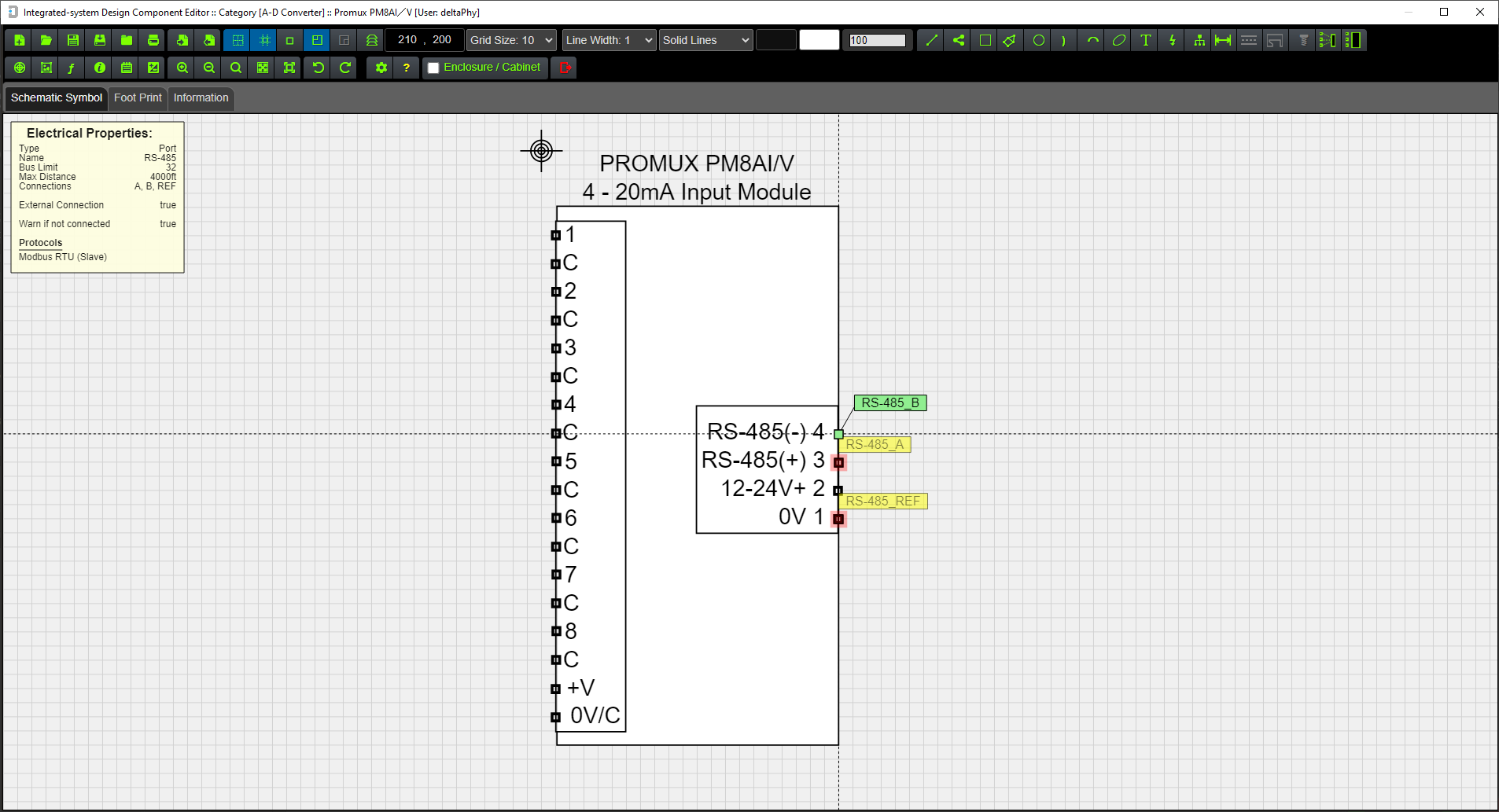
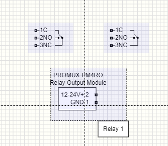
In the Schematic Editor the guidance system works for all electrial (voltage / current IO), miscellaneous objects and communication ports (RS-485, Ethernet, RS-232 etc).

Protocols supported by ports are taken into consideration when displaying compatible objects; a Modbus RTU Slave will be displayed as compatible with another Modbus RTU Slave because the bus is multi-drop.

A Modbus RTU Master will be displayed as compatible with a Modbus RTU Slave, but not with another Modbus RTU Master because you can't have two Modbus masters on the same bus.

The hardware layer must also be compatible before the Guidance System will indicate compatible electrical objects. For example, Modbus-master protocol running on RS-485 won't be shown as compatibe with Modbus-slave which is running on RS-232 etc.

To view a list of compatible electrical objects for a particular electrical object, right-click on the object and select 'List Compatibles' from the pop-up context menu.

This will open a dialog containing a list of all compatible objects for the one you right-clicked on.

The guidance system can be useful to help make sure RS-485(A) and (B) connections are the correct way around, or the port you intend to wire an SDI-12 sensor to is the correct one.

Image showing compatible lines.

In this example, the mouse is hovered on the ATMOS-41 SDI-12 wire. Lines are drawn indicating compatible SDI-12 ports on the YDOC, Campbell and DT-80 loggers. The red heads-up display and overlapping points list entry indicates the hovered-on component has an issue.

image showing  compatible lines
Image (below) showing compatible hot-spots while hovering mouse on SDI-12 data wire.
image showing compatible hot-spots

Using compatible Hot-spots or Lines (toggled by the C key) can improve readability depending on the number of compatible objects for the object being hovered on:
Image showing many Compatible Lines.
Image showing many compatible lines
Same image but displaying Compatible Hot-spots - this can be easier to read if there are too many lines.
Image showing many compatible hot spots - easier to read

Compatible indicators (lines or hot-spots) are color coded according to the type of electrical object:

Power
Voltage
Current
Ports
Digital IO
Miscellanous
Ground / Reference

If the lines are solid this indicates 'primary compatibility' which means for example a power input is compatible with a power output

If the lines are dashed this indicates 'secondary compatibility'. An example of this would be that a voltage input (with the correct input range) would be compatible with a power output which is really just a voltage output anyway.

Hot-spots have the same color coding but are not dashed with secondary compatible objects. They remain the same filled circle shape.

Back to top

Hovering on a wire

Hovering on a wire highlights all objects connected to the wire and all objects 'connected' via labels.

In this example, wire_2 is being hovered on resulting in all connected wires to be highlighted.

The blue circles indicate connected points and flash to help see which points are connected in the sheet.

In this example the label "0V" on the top left side is 'connected' to the "0V" label on the top right side of the drawing.

A list of overlapping points will be displayed on the right-hand side of the screen (if enabled).


See next section: Overlapping Points
Image showing wire_2 being hovered over.
Back to top

Overlapping Points

Hovering on a wire, a wire node or any object point which is connected to more than one other object will cause the overlapping points display to be shown.

All connected objects including those 'connected' via labels will be displayed in this list.

In this example, wire_2 is being hovered on and the resulting list of overlapping or connected points is displayed.

Pressing the SPACE BAR will select down the list and the selected object will be highlighted in the schematic sheet.

Pressing will select the previous overlapping point in the list.

Pressing will select the next overlapping point in the list.

If you are in the top-most sheet and the object is in another sheet, the sheet entry will be highlighted to indicate the overlapping point is in that sheet.

If you are in a sub-sheet, the corresponding label will be highlighted to indicate the overlapping point is in the top-most sheet.

Click here for more information on sheet entries

An overlapping point which is shaded red indicates an issue with that point.

An ovarlapping point which is appended by a [✓] means at least one object that is compatible with it has been detected.


Pressing ALT and using the mouse wheel will move the list up or down on the screen.

Pressing ALT again will place the list back to the top of the screen.


Pressing CTRL and using the mouse wheel will reduce / increase the size of the list.

Pressing CTRL again will set the size to the default size which is defined in user settings.


Pressing S will toggle overlapping points enable / disable.

Image showing wire_2 being hovered over.
Example Overlapping Points List
overlappint points list

Some entries in the list are appended by a [✓] which means at least one object that is compatible with it has been detected.

Overlapping List Element Explained:

Example overlapping list entry.
4:
The 4th element in the list
Current_Input_REF
Name of object point
(Current Input 1: Top Level)
Name of component: { Current Input 1 } Sheet name { Top Level }

This element is the 4th in the overlapping points list.

It is the electrical reference connection for an analog current (I) input and belongs to a component with a designator of 'Current Input' (actually part of a Promux 8AI/I module) which exists in the Top Level schematic sheet.

Note: Schematic sheet names are only displayed in the schematic editor, not in the component or layout editors.

Selecting a point for dragging

Apart from displaying a list of connected electrical points, the overlapping points list is also used to select an overlapped point under the mouse so you can drag it.

This includes any graphic point such as a rectangle or line graphic point.


In this image of a line and rectangle object, the line end-point is overlapped with the rectangle start-point.

We need to drag the rectangle start-point, but if we drag (hold left mouse button and move mouse) it will be the line end-point that is dragged:


line point overlapping rectanble point

Select the rectangle start-point using either:
SPACE BAR or / keyboard buttons.

Now you will be able to drag the rectangle start-point.

rectangle point selected in overlapping list

Note: You can only drag a point if it is directly under the mouse. A point that is selected in the list which is connected by a wire or label is unable to be dragged (unless it is direcly under the mouse).

Back to top

Magnifier

Pressing and holding the SHIFT key down will display the magnifier.

The magnifier can be zoomed in or out using the mouse wheel.

This can be usefull in a large schematic where you want to quickly zoom in to a part and check a connection or view some text etc.

There are several quality modes for the magnifier in user settings / preferences depending on which module you are currenlty using.

The Component Library Editor has two quality modes:

The Schematic and Layout Editors have four quality modes:

The Low quality modes reduce the quality of the overall image, but will still render a high-quality image of the object the mouse is hovering on.

Magnifying Glass
magnifying glass
Back to top

Sub-sheets

When the Schematic Editor is opened (this is the main screen which is opened after the login screen) you will be viewing the "Top-most" schematic sheet.

This is the default sheet which can be used to create electrical drawings.

In addition to this sheet, an unlimited number of sub-sheets can be added.

These sub-sheets can be named to give them some context within the main (top-most) drawing.

For example, one sub-sheet may be called "Control Room" or "Packing Room" etc.

Sheets can be entered (to edit their contents) by double-clicking on them or right-clicking and using the pop-up context menu option 'Edit Schematic'.

Connections can be made from the top-most sheet to components within a sub-sheet by adding Sheet Entries and / or Floating Sheet Entries.

Example Multi-sheet Schematic
image showing subsheets

In this example there are 3 sub-sheets: 'Control Room', '240VAC Contactors', and 'Power Supply'.

These are all contained in the top-most schematic sheet.

In this example, schematic entries are set to act as labels, so the software considers sheet entries are connected to labels with the same name.

(Use the toolbar button to toggle sheet entries acting as labels toolbar button to enable (or disable) schematic entries to act as labels)

This means the 3 labels '+24V', 'GND' and 'Ethernet' connected to the 'Control Room' sheet will also be connected to the other two sheets because their sheet entries will connect with the corresponding labels with the same names / tags.

If this is not suitable, the next drawing is redrawn so the connections are explicit and easier to see.


Example of same schematic as above, redrawn for clarity.
image of subsheets redrawn for clarity
Example Multi-sheet Schematic
image showing 100 subsheets

You can add multiple sub-sheets to the top-level sheet and rename + color-code them as required.

Back to top

Sheet Entries

Right-click a sub-sheet and select Add / Remove Sheet Entries

This will open the Add / Remove Sheet Entry dialog where you can select which labels contained within the sub-sheet are to be made available to the top-most sheet.

There must be at least one label in the sub-sheet to be able to add sheet entries. These labels are able to connect to components in the top-most sheet.

If there are no labels in the sub-sheet, a message will be displayed.

In this example, clicking on the "24V" button in the dialog and clicking "OK" will produce a sheet entry labelled "24V" on the sub-sheet.

This sheet entry can be moved around the edge of the sub-sheet as required.

Access to components inside a sub-sheet can also be done using Floating Sheet Entries.

These sheet entries are placed using the toolbar button to place floating sheet entry toolbar button.

Once it is placed it can be configured by right-clicking on it to access the context pop-up menu and clicking 'Configure Floating Sheet Entry'.

Example Floating Sheet Entry
example floating sheet entry
Add / Remove Sheet Entries Context Menu
popup menu to access add / remove sheet entry dialog
Add / Remove Sheet Entries Dialog
add / remove sheet dialog
Resulting Sheet Entry

(From clicking 'Add / Remove Sheet Entry in pop-up menu.')

example of sheet entry

Hovering on Label

Hovering on the RS-485(B) label highlights the RS-485(B) schematic sheet entry on the Control Room 1 sheet.

The Floating Sheet Entry just to the right of the sub-sheet is also highlighted.

This is because sheet Entries are set to act as labels as the toolbar button to toggle sheet entries acting as labels toolbar button is active.

image showing hovered on label highlighting sheet entry and other label.
Hovering on Floating Sheet Entry

Hovering on the RS-485(B) Floating Sheet Entry also highlights other labels with the same name including the RS-485(B) sheet entry on the Control Room 1 sheet.

Note how the Control Room 1 sheet is highlighted in green. This is because the Floating Sheet Entry is configured as a sheet entry to that sub-sheet. This helps to highlight which sheet a Floating Entry is configured for.

image showing hovered on label highlighting sheet entry and other label.
Back to top

Labels

Labels connect parts of a schematic diagram together.

If the mouse is hovered on a label point, all other labels with the same tag name will be highlighted.

The overlapping points list will also indicate all points that are connected to the labels.

Using the context menu (right-click on label) several options can be accessed:

Edit Properties to edit graphic properties
Edit Label Tag to change the name of the label
Make Bus Entry to format suitable for bus-entry

Changing the name of the label will change which other labels it will be connected to.

Using Make Bus Entry will format the graphic properties to have smaller font, transparent background which may be suitable for use with buses.

Click here for more information on buses.
Hovering the mouse on a label point displays all points connected to all other labels with the same names / tags.
image of label
Hovering the mouse on a label highlights all other labels with the same names / tags:
image showing label being hovered on highlighting other labels
Back to top

Heads Up Display

There are two types of heads-up display:

The Component heads-up is displayed when hovering on a component. It displays the components functions, supported protocols and measurements provided for by the component.

It also lists any issues detected such as disconnected points, missing requirements or possible conflicts.

If there are any issues with the component, the heads-up display will be drawn with a slightly red background.

An example of a missing requirement would be for a rechargeable SLA battery that requires an SLA charger to be connected to it. If there is no SLA charger connected to it, then warnings will be produced.

The Heads-up display is toggled using the Toggle heads-up display toolbar button toolbar button or by pressing the H key.

The Electrical Object heads-up is displayed when hovering directly over an electrical object in a component (for example a digital input connection).

If there is more than one object at that point, they will be displayed in the Overlapping Objects List (top right corner of screen) and you can select which one to view using:
or SPACE BAR keys.

Example Heads-up: Hovering on Component.
example component heads up display
Example Heads-up: Hovering on Component's Electrical Object.
example electrical object heads up display
Back to top

Color Picker

Features 138 colors.

Selected color is indicated by a glow effect.

A larger color swatch at the bottom of the dialog shows the currently selected color.

image of color picker dialog
Back to top

Schematic Snippets

Schematic Snippets allow you to save and open frequently used drawing parts.

Access the snippets dialog by clicking the toolbar button to access snippets dialog toolbar button.

The snippets are contained in useful categories which you can create or delete as needed.

Examples of categories could be:

You can add as many snippets into the schematic to save time re-creating drawings that are used often. This will increase efficiency and productivity when creating new projects.

As an example, you could load a bank of relay / contactor components, then add a power supply etc.

Select the category and the snippet you need and click the 'Open Snippet' button to place it onto the current schematic sheet.

Snippets are automatically grouped to make it easier to move them around in the sheet. They can be ungrouped at any time by using the pop-up context menu: Groups->Ungroup.

Snippets can be easily renamed if needed, or deleted if required - just select the snippet and click the 'Rename' or 'Delete' buttons to rename or delete a snippet.

To create a snippet select a part of the schematic and right-click to get a pop-up context menu. Click 'Save Selected As Snippet' to open the snippet save dialog.

Alternatively, you can use the menu option File->Save Schematic As Snippet which will save all schematic objects in the current sheet as a snippet.

The snippet dialog allows you to create / select a category and save the selected schematic objects as a snippet.

Note: At this stage, Layout objects are unable to be included in snippets.

Open Snippets Dialog
image of snippets dialog

You can create as many snippet categories as you like to help manage commonly used schematic parts.

Snippet Save-as Dialog
save-as snippets dialog with thumbnails

Existing snippets shown as thumbnails with filename

save-as snippets dialog with thumbnails

Existing snippets shown as filenames

Back to top

Discrete Components / Parts

Discrete components / parts is a way to manage sub-parts within a component.

The example we often use is a Promux 4RO relay contact output component controlled using Modbus RTU over RS-485.

Some time ago we reviewed a schematic drawing from a control-system design company.

The drawing showed 5 relay contactors from the Promux 4RO, but in reality this device only provides 4 relay outputs.

This error, while easy to make, required an adjustment of the schematic and layout of the project to accomodate another PM4RO.

It also required more PLC configuration to allow the PLC to communicate with the additional 4RO because the PLC configuration was designed at the time of the layout design.

The discrete component / parts feature allows the designer to only extract the number of relay outputs that the device provides.

If they needed 5 and the 4RO only has 4, then issue is picked up in the schematic design phase before PLC configuration and physical layout takes place.

Click here for more information on Discrete Components
Component Containing Discrete Parts
image of component containing discrete parts
Example showing 2 extracted relay contact parts
image showing extracted relay contacts

Note when hovering on a discrete component, its extracted parts are highlighted in light blue.

Extract discrete parts using the context pop-up menu (right-click) and select Extract Discrete Components.

Example Green and Red highlights after clicking on component in the navigator.
Example Green Highlight
image of component highlighted in green

This example shows the result of clicking on a green (no issues) component in the Navigator.

Example Red Highlight
image of component highlighted in red

This example shows the result of clicking on a red (issues detected) component in the Navigator.

Back to top

Physical Layouts

Once the schematic diagram is complete (or partially complete), physical layouts can be designed.

Click the toolbar button to add layout object to schematic icon on the toolbar to add a layout object.

A new layout object will be created and will be dragged around by the mouse.

Left-click the mouse to place it on the schematic or ESC to cancel the layout object.

To enter the layout, either double-click on the layout, or right-click to open the context pop-up menu and select:
Edit Layout.

You can change the layout graphic properties using:
Edit Properties

You can also change the layout name using:
Edit Layout Tag

The layouts notes can be viewed and edited using:
Edit Layout Notes

These notes are also accessable from within the layout object also.

Layouts can be moved anywhere in the schematic and re-sized by dragging the top-left or bottom-right object points.

Click here for more information on Physical Layouts
Layout Object in Schematic
Image of Layout Object
Layout Object Context / Pop-up Menu.
Image of Layout Object context menu
Layout Module.
Image of Layout Module showing components in an enclosure

Example of Layout Module showing components in an enclosure. If you hover your mouse over an electrical object in the layout, blue lines will indicate where that object should be physically wired to according to the schematic diagram.

The light grey lines are 'Air wires' which also indicate where those electrical objects should be wired to. When you hover your mouse over any of the electrical objects connected by air wires, the air wires will be drawn in blue to accentuate them.

Back to top

Communication Protocols

Communication ports and some digital IO and analog IO are able to support some form of communication protocol.

Integrated-system Design comes with approximately 100 predefined protocols and you can create your own or modify the default ones as required.

Protocols are taken into account when using the guidance system in the schematic editor.

For example, if there are two RS-485 ports in the schematic and one is hovered on with the mouse, the guidance system will check both port's protocols and indicate whether the are compatible or not.

Protocols are applied to component's electrical objects (e.g. ports) in the Component Editor using the PMA (Protocols, Measurements and Additional Functions) dialog.

Any protocols added to any electrical objects in a component will be listed under 'Protocols' when the schematic designer hovers their mouse over the component. The designer can quickly see what protocols the component supports.

Hovering over the electrical object that supplies the protocol, will also indicate the list of protocols supported by that electrical object.

Protocols are added to electrical objects using the Protocol, Measurement and Additional Function Dialog (PMA Dialog) in the Component Library Editor.

Click for more information on the PMA Dialog
Protocol Manager Dialog.
image of protocol dialog

Some of the protocols above are blue which means the designer has modified them and they now exist in the 'Custom' database along side the default database.

image of edit protocol dialog

This is the edit dialog which is currently editing the DF1 Slave protocol. The highlighted buttons DF1 Slave and DF1 Master indicate that the DF1 Slave is compatible with both of these protocols.

Back to top

Additional Functions

Additional Functions are a means to describe in more detail, the functional ability of a component or an electrical object of a component.

They are also capable of carrying information required by the function.

For example, if the component is capable of providing DDNS, the hostname, username and password for the DDNS provider would be required. These questions / information are able to be provided in the schematic editor. The schematic editor Report will identify any required information that has not been provided.

Some information can be configured to be required while other information may not be (for example many APN username and passwords are not required).

Additional Functions are added to electrical objects using the Protocol, Measurement and Additional Function Dialog (PMA Dialog) in the Component Library Editor.

Click for more information on the PMA Dialog
Additional Function Manager Dialog.
image of additional function dialog

Edit Additional Function Dialog
image of additional function edit dialog

Example of editing an Additional Function. Some information is required while others may just be optional.

The Required Information section is for information that must be provided otherwise the Report Dialog will flag an error.

Use the Remove button to delete unwanted questions. The Add button will allow a question to be added to this Additional Function.

Add Required Question Dialog
image of Add Require Question dialog
Add Optional Question Dialog
image of Add Optional Question dialog
Back to top

Measurements

The Measurement Manager dialog allows you to create new measurements, or select existing measurements

In the Component Library Editor the Measurement Manager dialog is used to apply measurements to electrical objects.

For example, a 4-20mA current output may be used to indicate depth or pressure. It may be that 4mA represents 0m depth while 20mA represents 5m depth and is the maximum reading. The Measurement Manager would be used to select the depth range to apply to the 4-20mA output. If the depth range does not exist, then the Measurement Manager can be used to create it.

Measurements are added to electrical objects using the Protocol, Measurement and Additional Function Dialog (PMA Dialog) in the Component Library Editor.

Click for more information on the PMA Dialog
Measurements Manager Dialog.
image of measurement manager
Measurements Manager Dialog when called from PMA Dialog.
image of measurement manager when opened from PMA dialog
PMA Dialog.
image of PMA dialog
Back to top

Wires

integrated-System Design wires are not just graphical lines. When hovering over a length of wire or on wire nodes / points, a list of objects attached to the wire is displayed.

This list is the Overlapping Objects List and appears at the top-right side of the window.

In the Schematic Design module, any object directly under the mouse is listed at the top and separated by a line from those objects connected to the wire. The objects directly under the mouse can be selected using the SPACE BAR or the and buttons.

Wires can be placed via the wire & cable picker which is accessed using the toolbar button in the Schematic and Layout editors.

When placing wires, they can be forced to the nearest 45° and 90° angle using the toolbar button. Clicking This button will toggle the enforcement. If the toolbar button is colored blue, the feature is active. If it has a dark background, the feature is inactive.

Wires can be created in the Component Library Editor using the Electrical Properties Dialog.

Wire Picker Dialog.
image of wire picker dialog

Wire Picker Dialog with My Fourth Wire being hovered over. A tooltip to the right provides information on the wire being hovered on.

Click one of the wire buttons to place it on the schematic sheet.

Example Wire
image of wire in schematic editor
Back to top

Cables

Cables can be created in the Component Library Editor and can contain any number of wires that have been defined.

Cables can be placed via the wire & cable picker which is accessed using the toolbar button.

Click on one of the cable buttons to select it and start placing it.

When placing cables, they can be forced to the nearest 45° and 90° angle using the toolbar button. Clicking This button will toggle the enforcement. If the toolbar button is colored blue, the feature is active. If it has a dark background, the feature is inactive.

Cables can be created in the Component Library Editor using the Electrical Properties Dialog.

Cable Picker Dialog.
image of cable picker dialog

Cable Picker Dialog with 3-Way GP cable being hovered over. A tooltip to the right provides information on the cable being hovered on.

Click one of the cable buttons to place it on the schematic sheet.

Example 'Raw' Cable
image of cable in schematic editor

Initially the cable will look similar to this image above. The wires and cable width can be styled as in the next image.

Cables can be placed and styled within the Component Library , Schematic and Layout Editors.

If the cable is placed within the Component Library Editor, it can be styled and saved as a component. This means it can be accessed from the Schematic and Layout Editors easily using the Parts Picker (via the Place menu button)

Styled cables can also be saved in the Snippets library if you want to.

Example Styled Cable
image of cable in schematic editor

This cable has wires and cable width styled using the 'Edit Properties' dialog.

Cable Wire Hover Example 1
image of wire in cable conducting when hovered on in schematic editor

Wires connect objects. Hovering on one wire of a cable will show other connected objects.

In this case, the Overlapping Objects display is showing the wire being hovered on and also the wire at the other end of the cable.

Cable Wire Hover Example 2
image of wire in cable conducting when hovered on in schematic editor

In this example the wire at the other end of the cable is connected to a Digital Input object on the Halytech MicroSpider II Logger

The Overlapping Objects display is showing the wire being hovered on, the wire at the other end of the cable and the digital input connected to the other wire.

Back to top

Cable Length Warnings

Cable Length Warning in Layout Editor
image of cable being stretched too long in layout editor showing a warning

When cables are created in the Component Library Editor you can opt to have a 'fixed length'. This is the length the cable will be from the manufacturer.

The length is used in the Layout Editor to provide a warning if the cable is being stretched longer than this length.

Cable Length Warning In Layout Editor BOM Dialog
image of BOM dialog indicating cable length error

In the Layout Editor, any cable that is longer than it's 'fixed length' will be highlighted in red in the BOM and will indicate it's current length compared with it's 'fixed length'.

Back to top

Buses

Buses are often used in electronic / electrical schematics as a convenient way to indicate multiple connections.

Labels and wires can be attached to a bus. The labels can be formatted to suit 'bus entries' by using the context menu 'Make Bus Enry' option:

Context menu option to graphically format a label as a bus-entry
Example Bus in Schematic Editor
image of Bus in schematic editor showing labels and wires connected

Hovering your mouse over any bus entry label (or any label) will highlight all other labels with the same tag.

Image showing other labels with the same tag are highlighted when the mouse hovers over any one of them.

This makes it easy to see where your connections are routed to in the schematic.

Back to top

Bill of Materials Generation

Bills of Materials can be generated from the Schematic and Layout Editors.

When accessed from the Layout Editor the lengths of wires and cables are included in the bill of materials.

BOM from Schematic Editor
image of Bill of Materials dialog called from schematic editor
BOM from Layout Editor
image of Bill of Materials dialog called from layout editor
Back to top

Mounts

Mounts can be added to components in the Layout form-factor / footprint view of the Component Library Editor using the 'Mount' toolbar button in Component Library Editor toolbar button.

When hovering on a mount in the Mounts / Fastners Dialog, a tooltip will appear. The top line of the tooltip indicates other compatible mounts / fastners. The line below this is a general description of the mount / fastner. These properties can be created and edited using the Edit Mount Object dialog.

Mounts Dialog
image of mounts dialog

Hovering your mouse on a mount / fastner will show what mounts it is compatible with and also a brief description.

Edit Mounts Dialog
image of mounts edit dialog

Example editing a M3.5 Hole. The highlighted M3 x 6mm Stand-off indicates this is one mount object the M3.5 Hole is compatible with. Multiple compatible mounts can be selected in this dialog.

Back to top

Object Stack

All three editors (Component Library, Schematic and Layout) are able to show the object stack.

The object stack is toggled using the toolbar button to toggle object stack toolbar button.

The stack is displayed on the left side of the window and can be a convenient way to select / deselect objects.

Right-clicking any object in the stack will produce a context menu where you can delete or arrange object order in the stack.

Left-clicking any object will toggle its selection (selected or not selected).

Hovering on an object that is part of a group, will highlight the other objects in the group.

The stack can be hidden by clicking the toolbar button or pressing the ESC button on the keyboard.

Object selection can be quickly toggled by dragging down the list. If an object is not selected it will become selected and if an object is already selected it will become de-selected.

This is a quick way to toggle multiple objects selection rather than clicking each one individually.

Object Stack
image of object stack
Back to top

Frames

Frames are placed using the image of 'place frame' toolbar button 
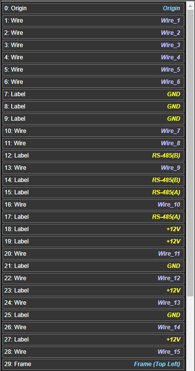
toolbar button or by using the Add Frame option from the frame menu:

image of frame submenu

Frames background and font / line colors can be styled using the Frame Editor dialog. Font sizes, aspect ratio and the number of columns and rows are also configurable using this dialog.

Frame 'boxes' that contain text and graphics can be selected using the Frame Editor.

You can create your own styles of frame boxes using the Component Library Editor and save them under the category 'Schematic Frame'.

Any number of fields can be created and styled in colors and positions you prefer in this editor. You can add your own logo / graphics and if saved in the 'Schematic Frame' category, you can select from your frame boxes in the Frame Editor Dialog and alter the text for each new project as needed.

Basic Frame (no text box)
image of basic frame with no text box
Frame (with text box)
image of frame with a text box
Frame Editor Dialog
image of frame edit dialog

This is where you can select the style of text box required for the schematic / layout drawing and also the number of columns and rows, background color, text color, font size and aspect ratio.

The Frame Editor dialog can be accessed by either right-clicking a frame point (top-left or bottom-right) and selecting Edit Frame Properties from the context menu or by using the Tools -> Schematic Frame -> Edit Frame menu option.


Frame Box Text Editor Dialog
image of frame text box editor dialog

This dialog allows the text in the frame text box to be edited.

Clicking on any of the blue squares over the text will bring up a text dialog where you can make the changes for that text item.

The Frame Text can be edited by either right-clicking a frame point (top-left or bottom-right) and selecting Edit Frame Text from the context menu or by using the Tools -> Schematic Frame -> Edit Frame Text menu option.

Back to top


Notes

Notes can be added to the top-level schematic, sub-schematics, layouts and components.

Each individual sub-schematic, layout and component can contain their own individual notes.

The User Settings in each of the editors (Component Library, Schematic and Layout Editors) can be set to automatically display notes when a component, schematic sheet or layout is opened.

This can be helpful if there are issues that you want shown when the document is opened. When automatically shown, the notes will be displayed for 5 seconds. You can view them for longer at any time using the image of notes dialog toolbar button.

You can edit component notes from the Schematic and Layout Editors by right-clicking on the component and selecting Show / Edit Component Notes from the context menu.

Notes Dialog
image of notes dialog
Back to top

Snap to Target

Snap to Target is a feature in the Schematic and Layout Editors.

If a wire is being dragged and the mouse cursor is in the 'snap-to' range, this blue graphic Snap target graphic image will flash indicating that if you release the left mouse button, the wire will automatically snap to the electrical object.

Electrical objects that are compatible with other electrical objects connected to the wire will be favoured to 'snap to'.

This feature can be toggled using the T keyboard button or by using the Toggle snap-to function toolbar button toolbar button.

If the toolbar button has a blue background the function is active. A dark toolbar button background indicates the function is not active.

Snap to Target Indicator
image snap to target indictor graphic

You will notice a blue circle around the mouse cursor when integrated-system Design is detecting electrical objects to snap to. Any electrical objects that fall within the range of this circle will be included for the snap feature. Objects that are compatible are given preference.

Back to top

Copyright © 2022
deltaPhy Software Systems
ABN: 35 734 274 896
This website uses cookies to maintain state and features available to you. No data is passed on to any 3rd parties. By continuing to browse this website, you consent to the use of cookies.